Trojan Condom Rebranding Project Refined (2021)
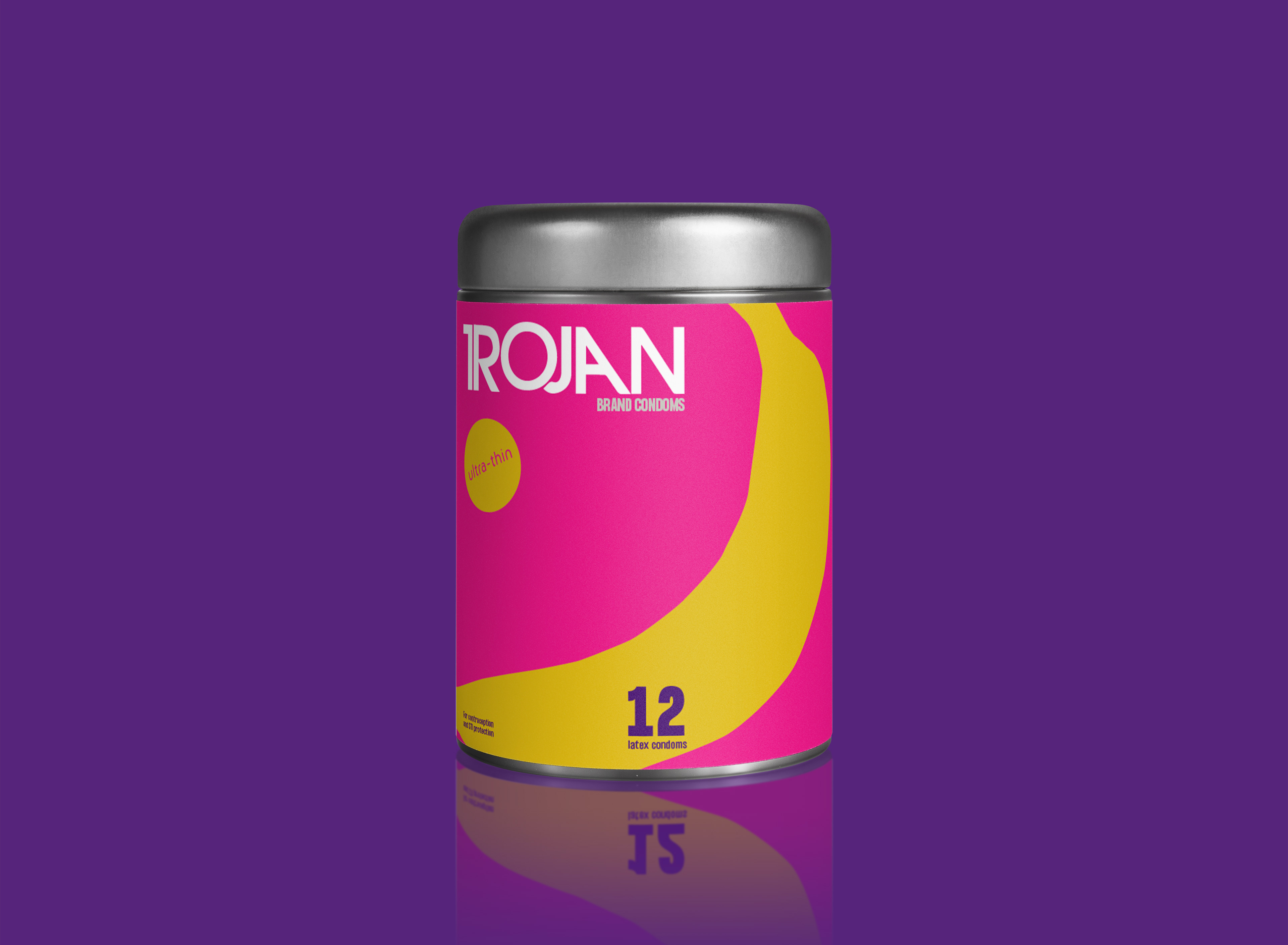
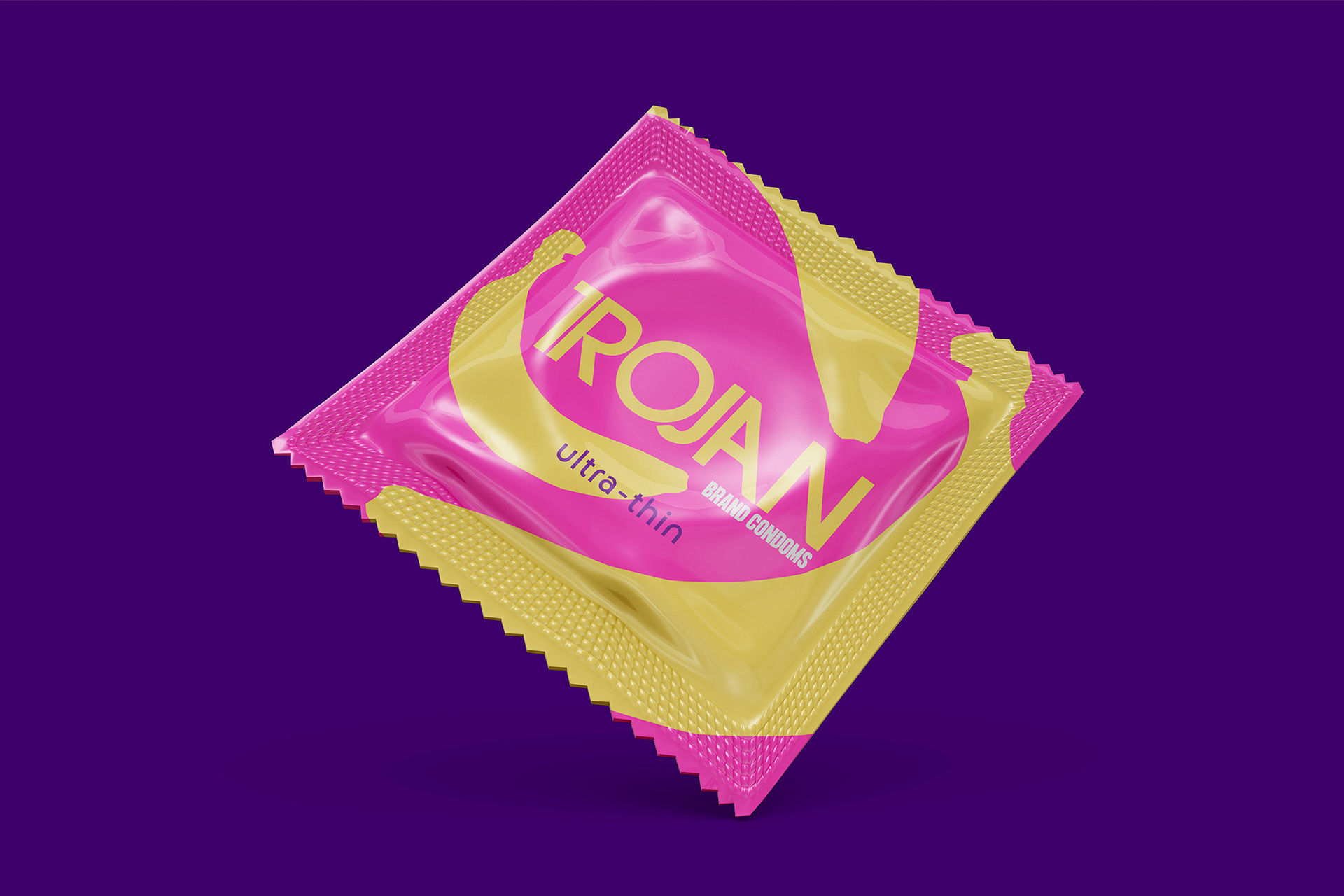
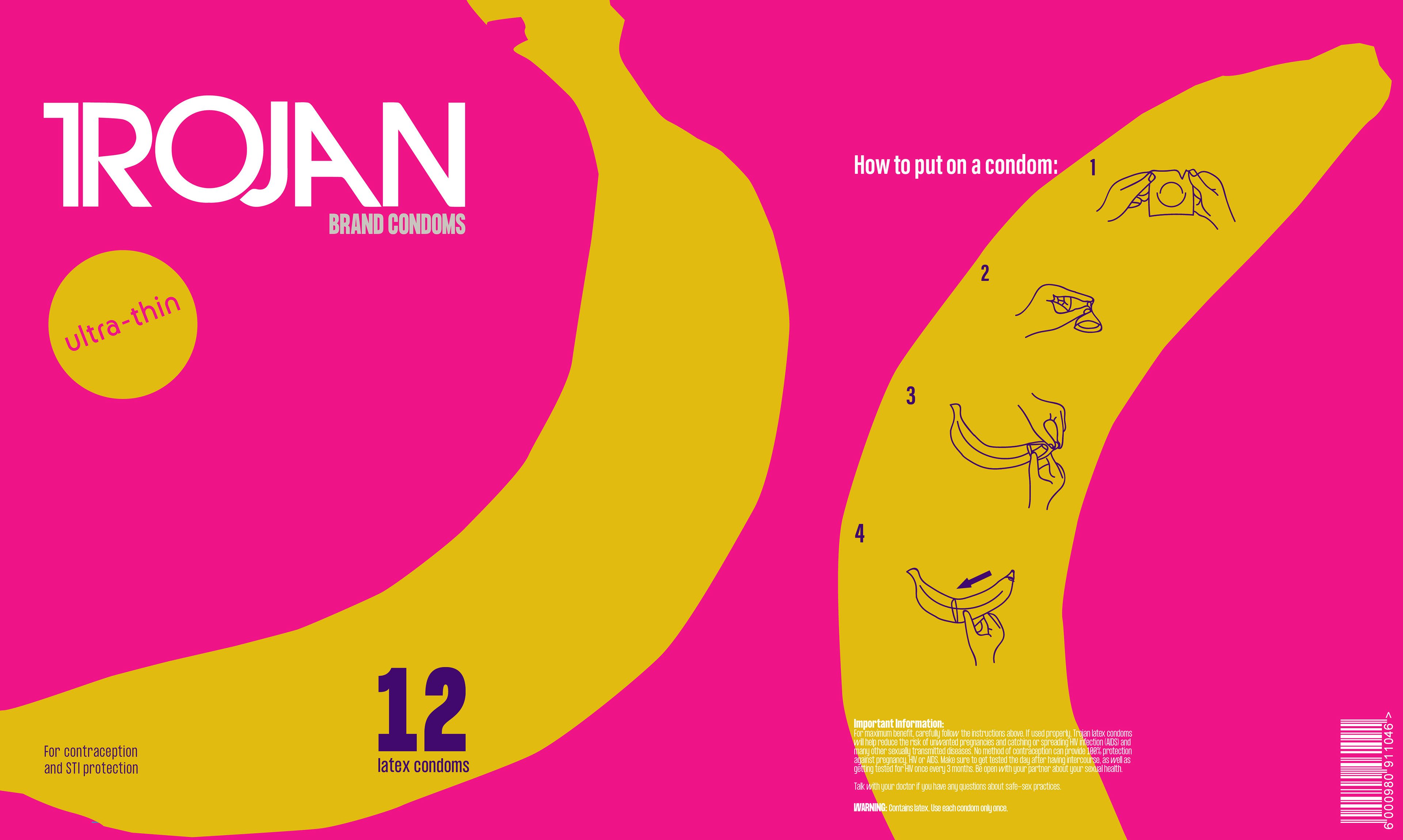
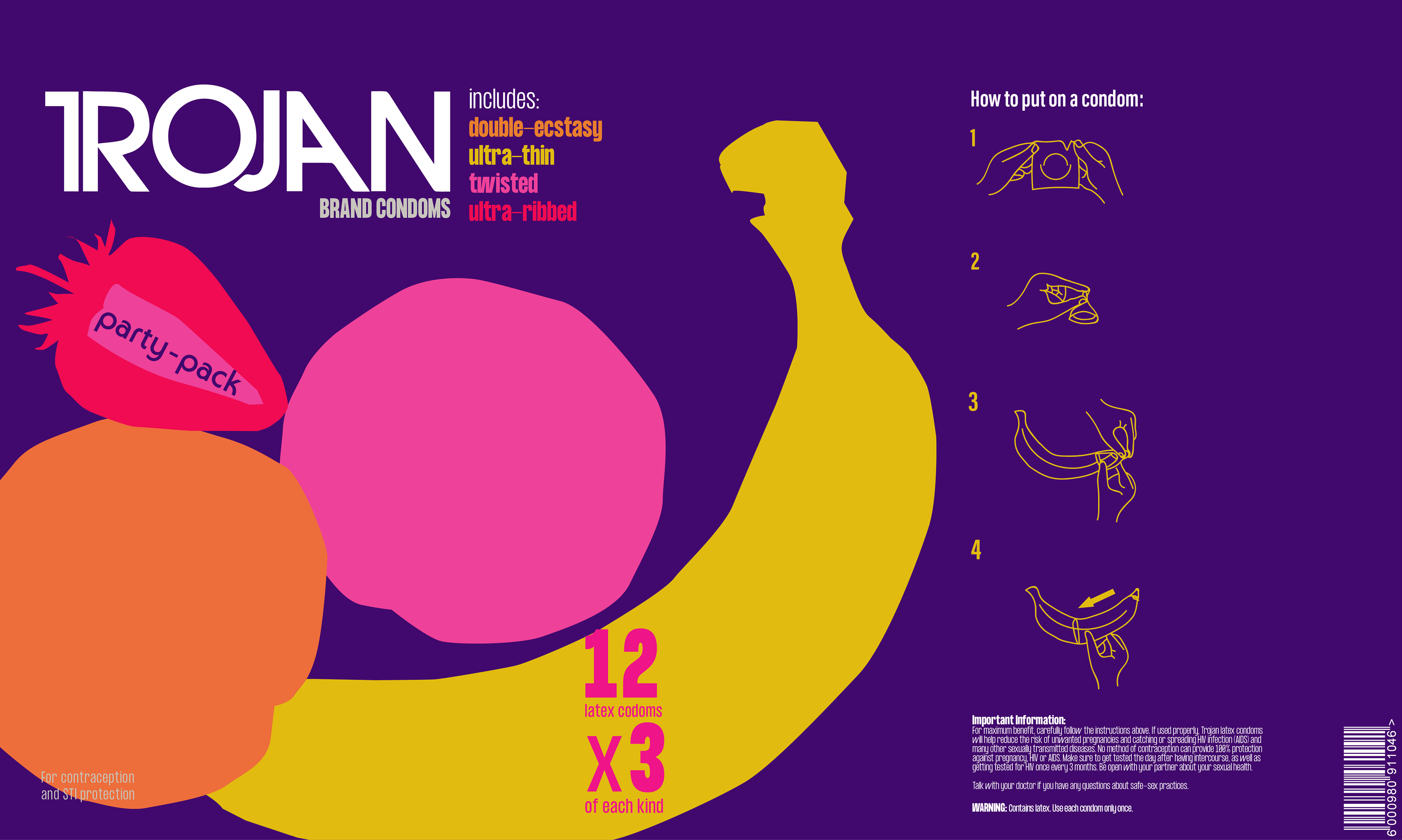
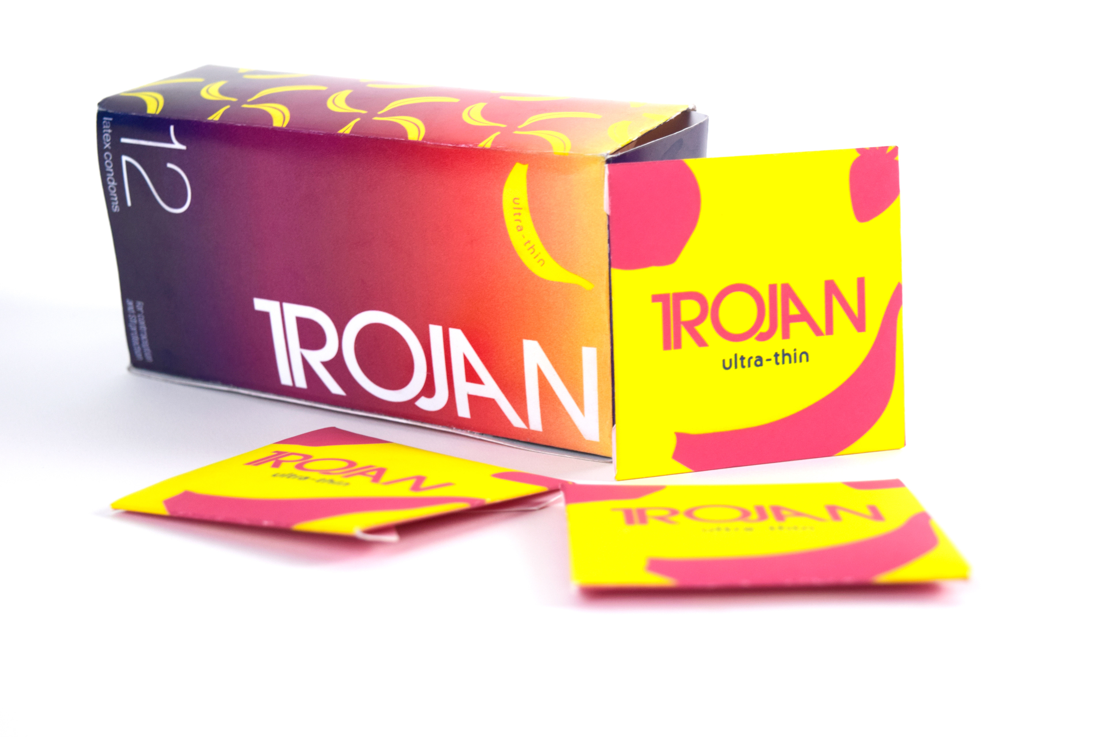
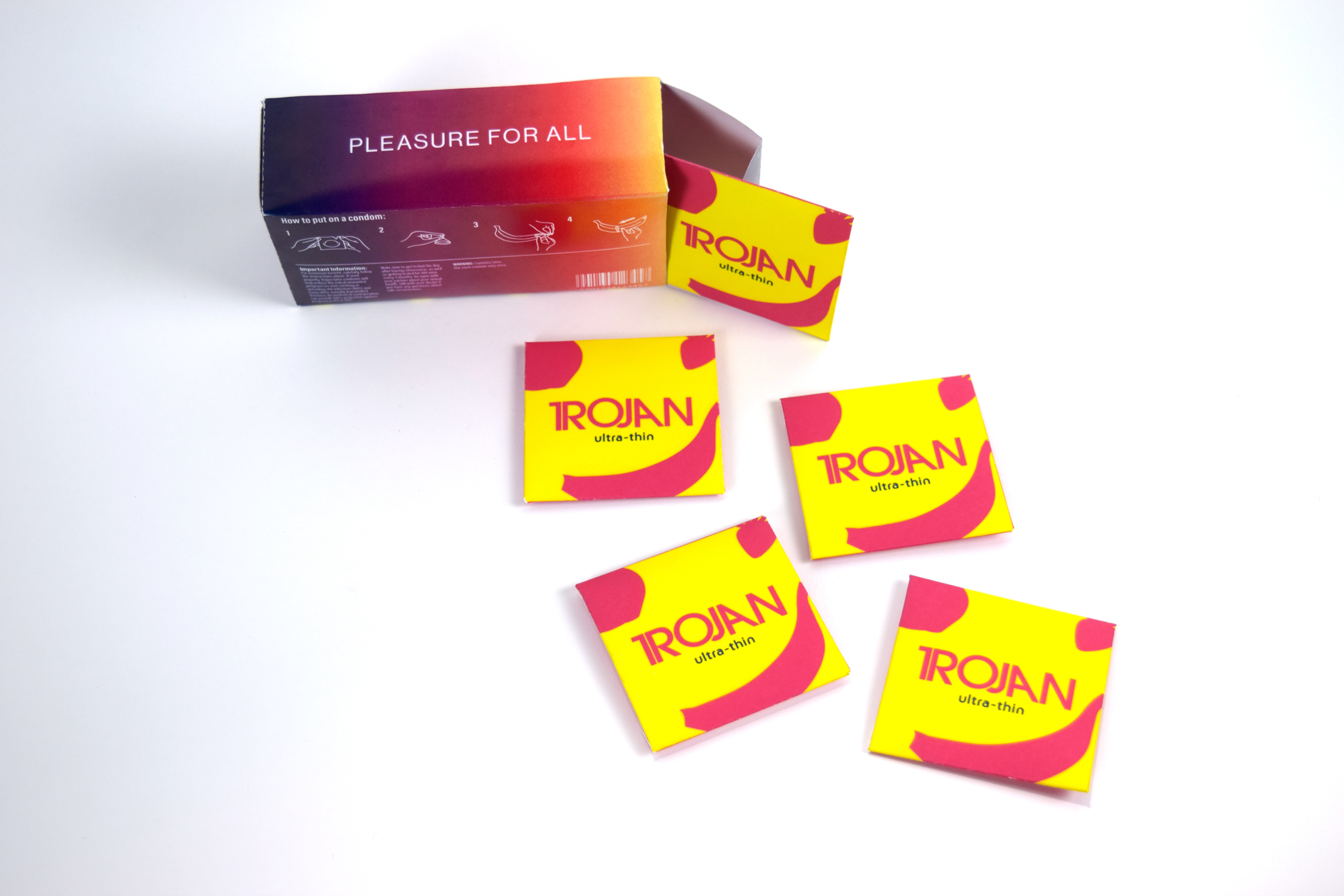
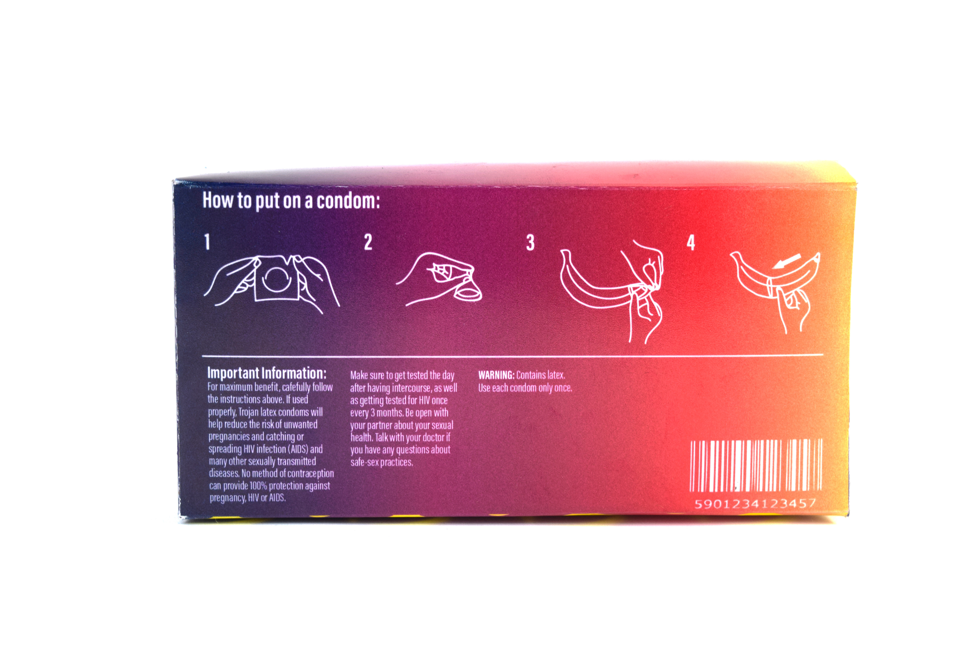
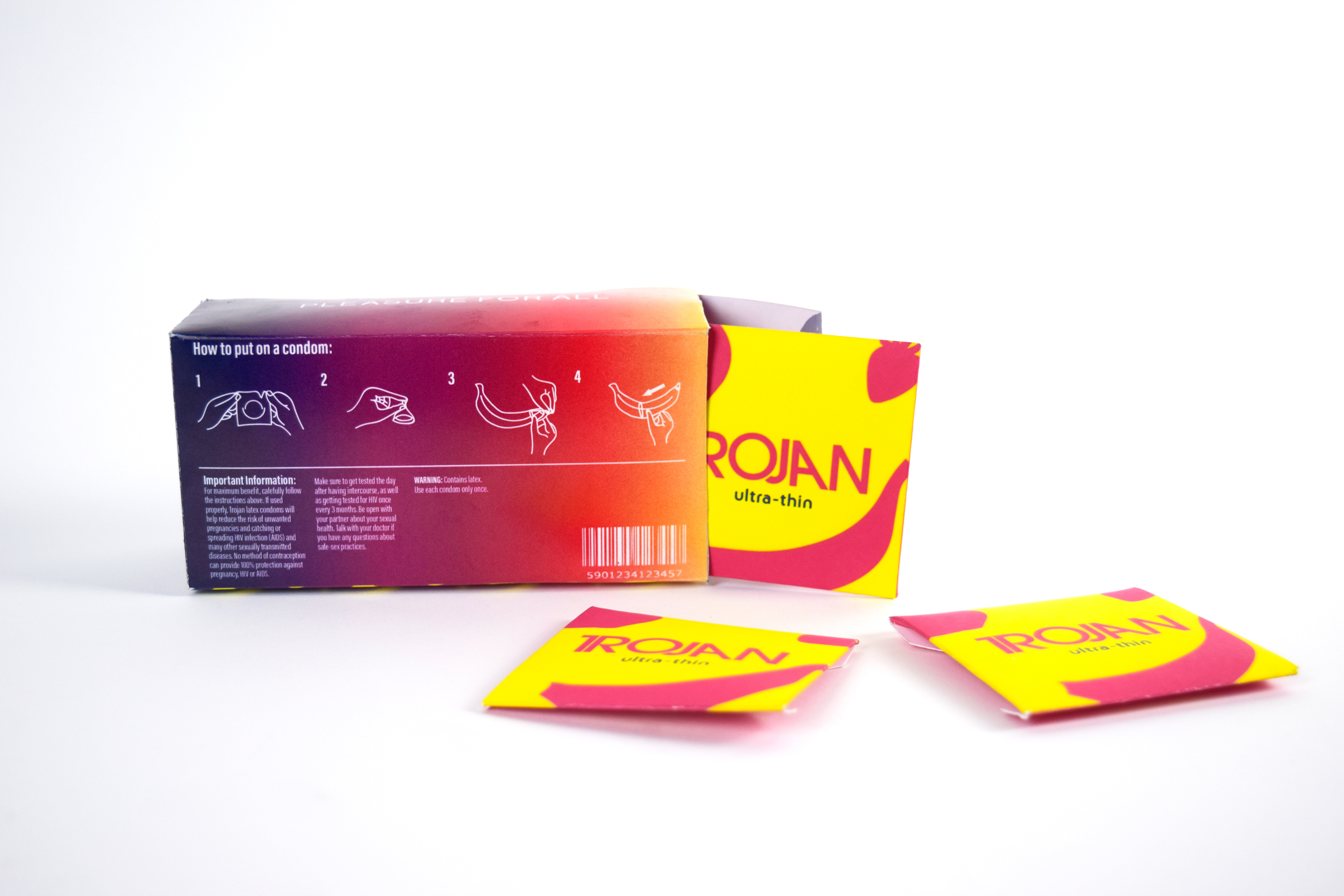
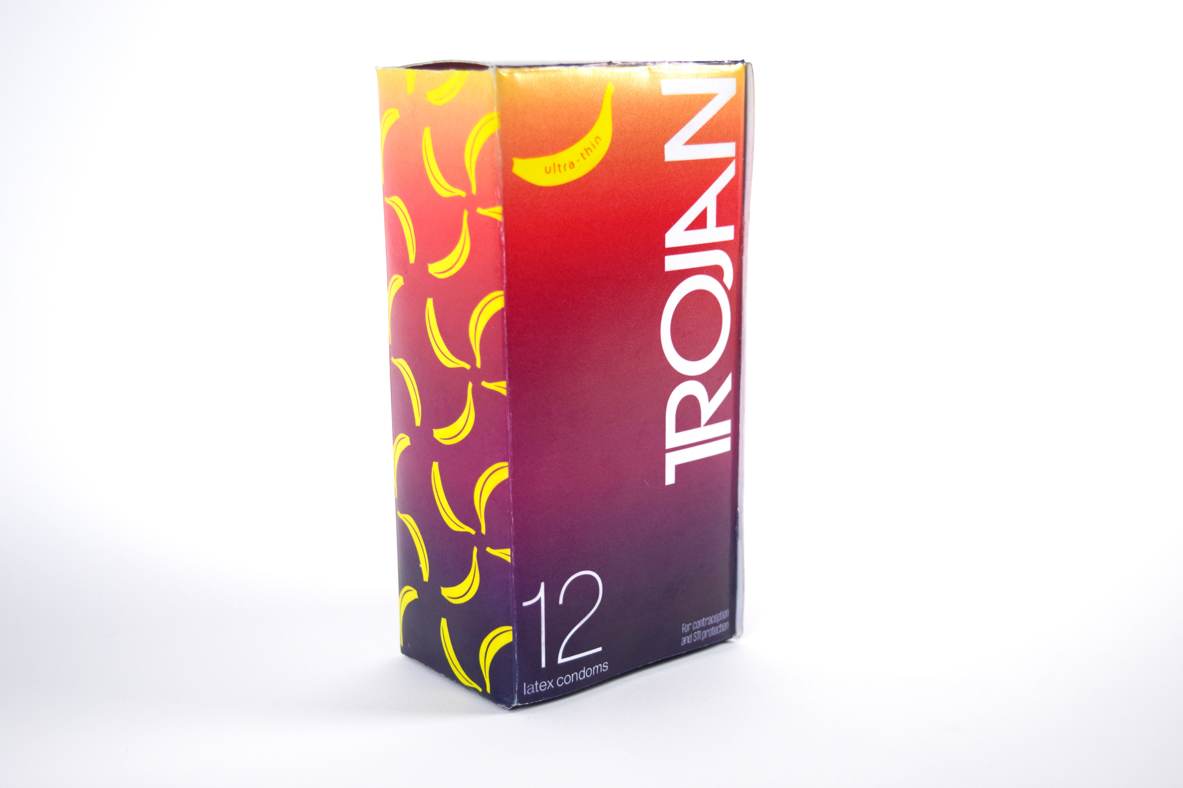
I chose to dive back into my 2021 Trojan Condoms packaging design to give it a more updated look. I continued to market to their LGBTQ+ consumers, with a vibrant, playful look inspired by 80’s Marimekko patterns. I continued to used fruit as an analogy throughout the packaging system to represent sexual identity, and that all fruit are welcome to the party. Ultra Thins, Party-Pack, Individual Wrappers
I chose to dive back into my 2021 Trojan Condoms packaging design to give it a more updated look. I continued to market to their LGBTQ+ consumers, with a vibrant, playful look inspired by 80’s Marimekko patterns. I continued to used fruit as an analogy throughout the packaging system to represent sexual identity, and that all fruit are welcome to the party. Ultra Thins, Party-Pack, Individual Wrappers
Trojan Condom Safe-Sex PSA (2020)
Since my initial, 2019 LGBTQ+ rebranding of Trojan Brand condoms, the COVID-19 pandemic hit, and dating in real life was obsolete for a full year in the United States. On the bright side, this lead to an increase of safe-sex practices and a rise in both condom sales and experimentation between partners. Tagline: "Babe, Let's Stay In".
Since my initial, 2019 LGBTQ+ rebranding of Trojan Brand condoms, the COVID-19 pandemic hit, and dating in real life was obsolete for a full year in the United States. On the bright side, this lead to an increase of safe-sex practices and a rise in both condom sales and experimentation between partners. Tagline: "Babe, Let's Stay In".
ad campaign for trojan
Trojan Condom Rebranding Project. Market: LGBTQ+ Millennials (2019)
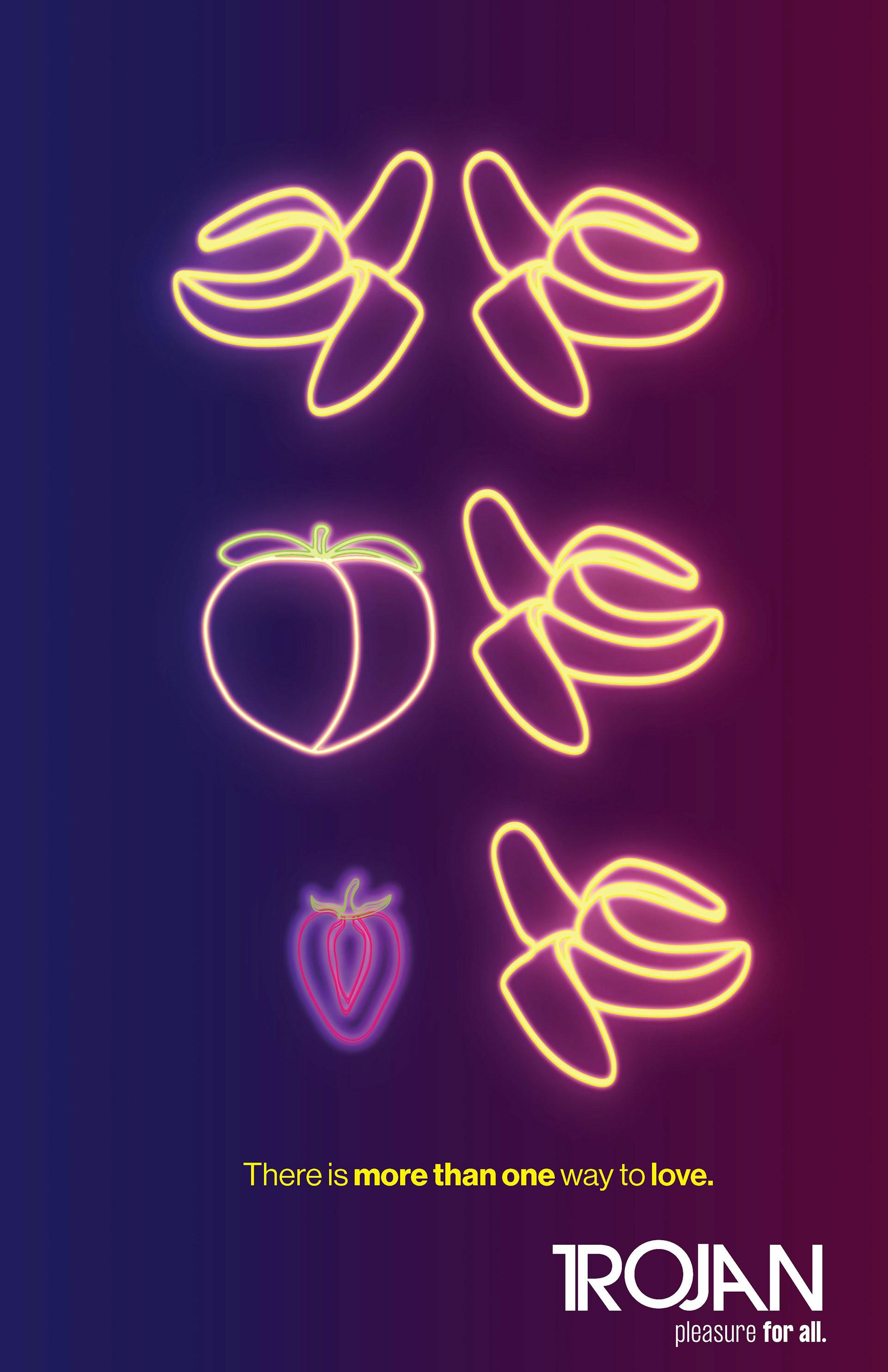
My concept for my Trojan Condom Rebrand was to re-market the condoms to queer millennials, as I noticed in my research that Trojan's original packaging was very disjointed and hyper-masculine. With the rebrand, I used fruit as a form of satire and symbolism for homosexuality, paying homage to the 70's disco era while, still being modern and youthful. The logo pushes the idea of sex with the "J" penetrating the "O" in "TROJAN". Since I wanted Trojan's Condoms to be used for all sexualities, the tagline "Pleasure for All" came naturally. No matter what fruit you identify as, you are always welcome to the party!
My concept for my Trojan Condom Rebrand was to re-market the condoms to queer millennials, as I noticed in my research that Trojan's original packaging was very disjointed and hyper-masculine. With the rebrand, I used fruit as a form of satire and symbolism for homosexuality, paying homage to the 70's disco era while, still being modern and youthful. The logo pushes the idea of sex with the "J" penetrating the "O" in "TROJAN". Since I wanted Trojan's Condoms to be used for all sexualities, the tagline "Pleasure for All" came naturally. No matter what fruit you identify as, you are always welcome to the party!